TRADEWORK
Building a distinct brand and product experience as the first dedicated designer for a contractor SaaS startup, spanning brand definition, marketing, and product design.
Context
TRADEWORK is a five-year-old startup building software that helps contractors manage their work end to end, from intake request to job, customer communications, supplies tracking, invoicing, and billing. It was founded by a contractor who understood firsthand how difficult it is to do the work while also running the business.
The product worked, but it hadn't begun to gain traction. The team had no marketing site, and they knew the product needed a more cohesive design direction. Before development started, they had hired a designer to explore early concepts in Figma, but two engineers carried the product forward for years, and the visual and UX debt had compounded.
I joined TRADEWORK as their first dedicated designer and took ownership of the design direction across the full surface area: product, brand, and marketing.
What needed to change
To create a product with a more intentional and cohesive feel, I set out to address three things.
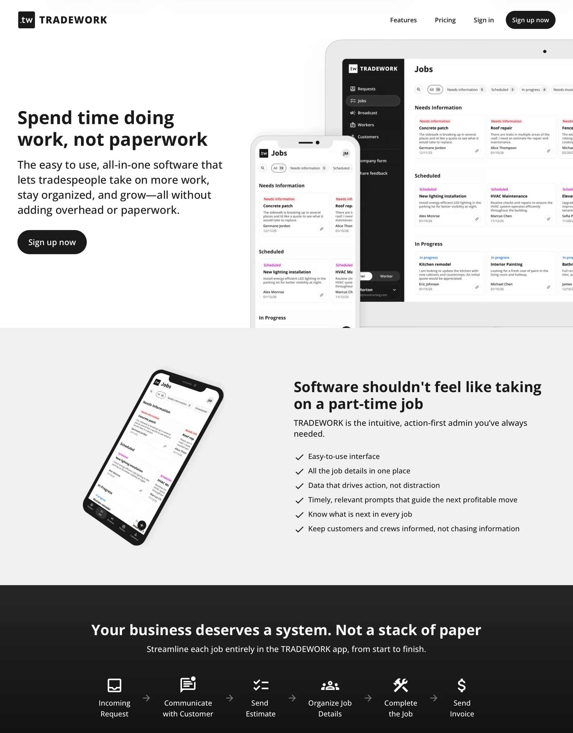
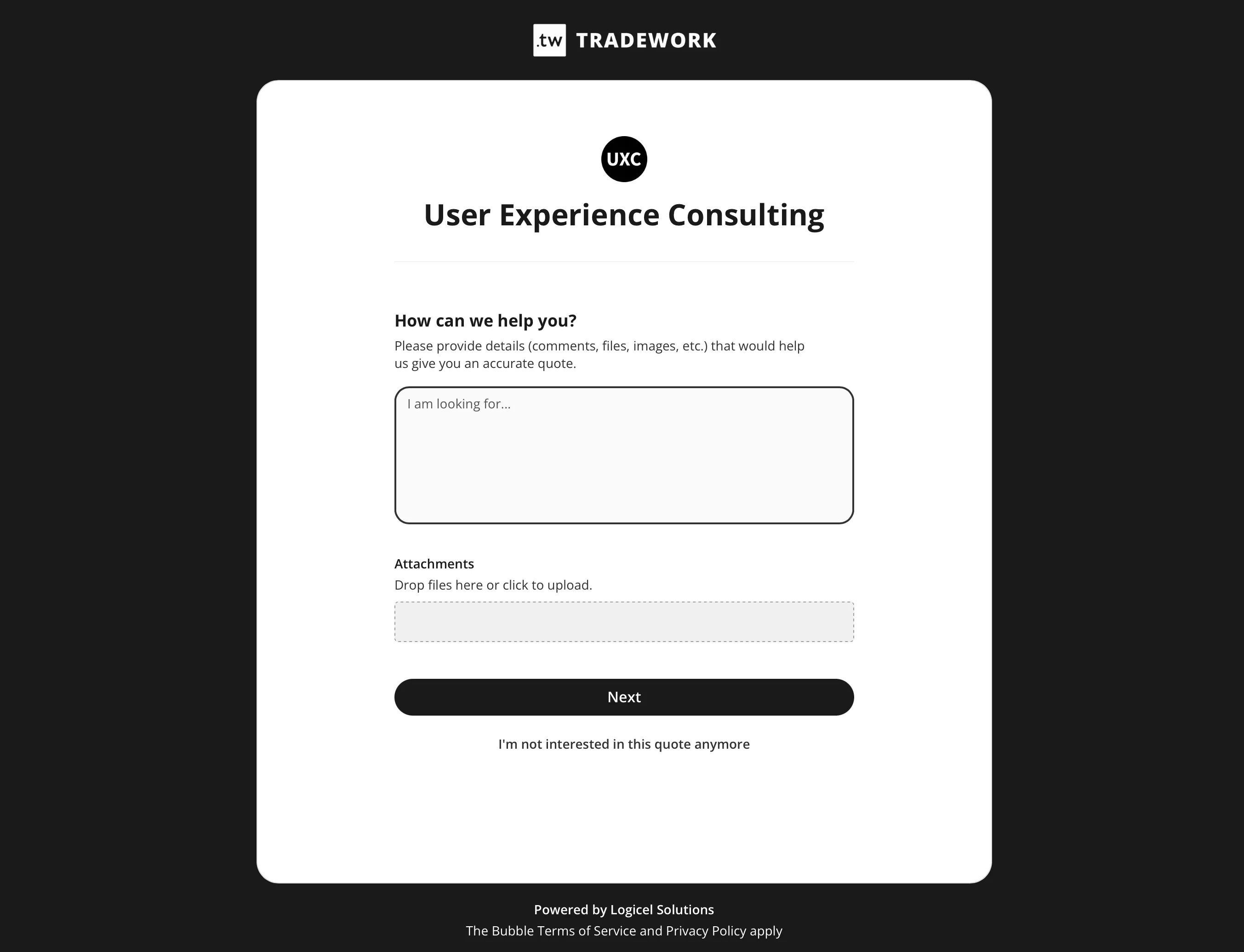
Brand and marketing needed a cohesive foundation. From the product logo and brand presentation to business cards, LinkedIn presence, the missing marketing site, and the product UI, TRADEWORK needed end-to-end consistency that fit its users and their context.
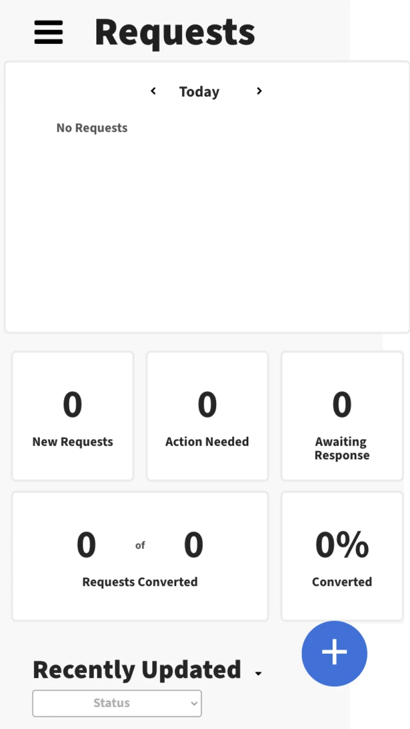
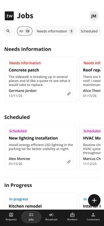
The product needed UX/UI refinement. The application was functional, but inconsistent and not meaningfully usable on mobile. Components and styles varied screen to screen, features had grown organically without a consistent design direction, and every new deployment added to the design debt.
The product needed thoughtful feature enhancements. Users needed features that supported the way they worked without adding clutter to the interface or requiring heavy onboarding.
Approach
Our first approach was to review each screen, annotate improvements, and hand them off for development. It helped surface issues, but it also created a heavy QA loop afterward.
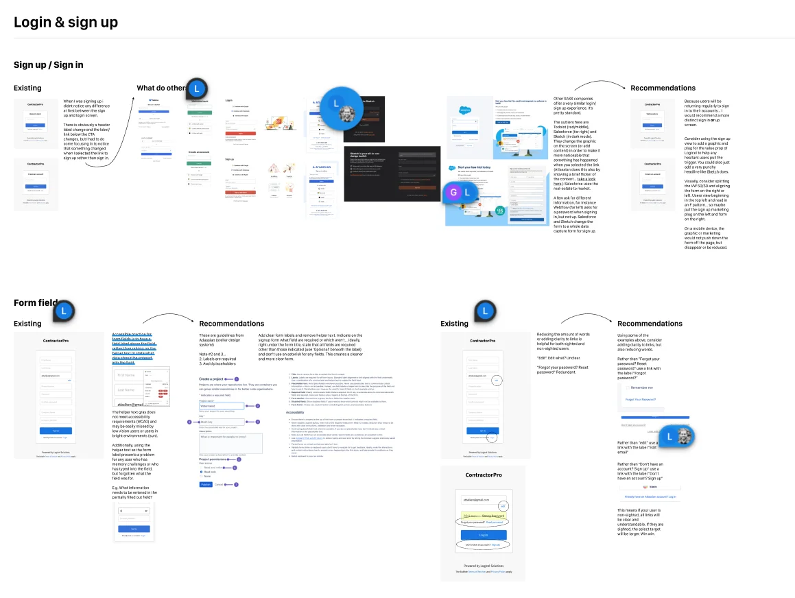
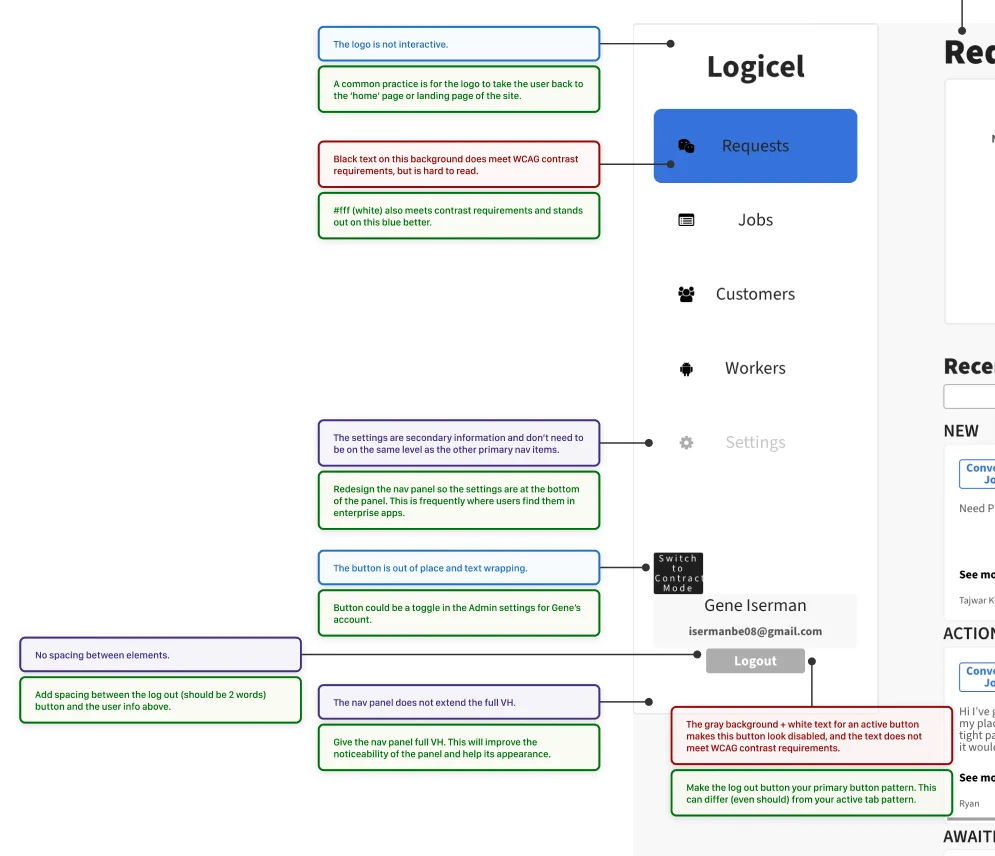
Unfortunately, this cadence wasn't sustainable and didn't give me sufficient ownership of the design direction. Instead, I formed three design initiatives that could move in parallel: update the product with a responsive, more polished UI, design and build the marketing page, and make UX improvements for existing and new features.
1 · Branding
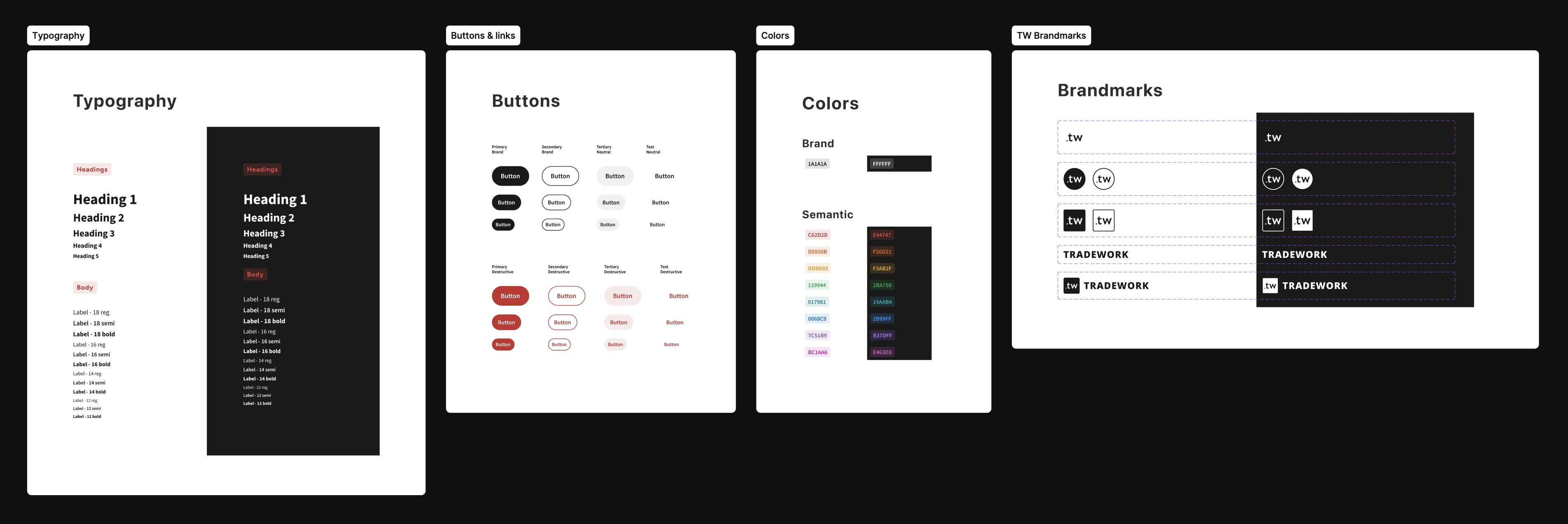
I rebuilt the brand system across logo, typography, color, voice, and the visual language that would carry into business cards, LinkedIn content, the marketing site, and the product itself.
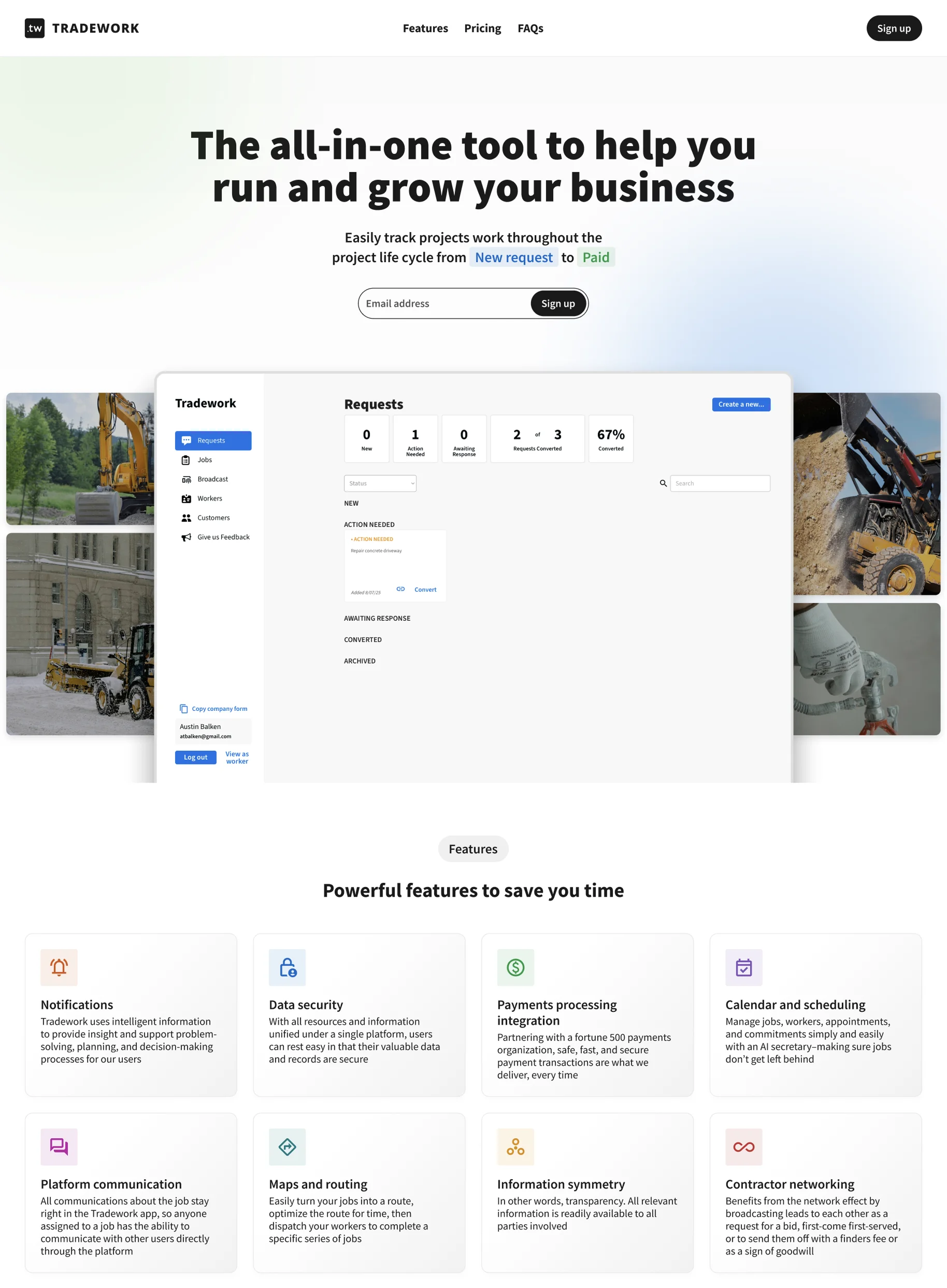
The goal wasn't a brand refresh for its own sake. It was to make every touchpoint a contractor encountered, from a LinkedIn ad to the marketing page to the product itself, feel like it came from the same company.
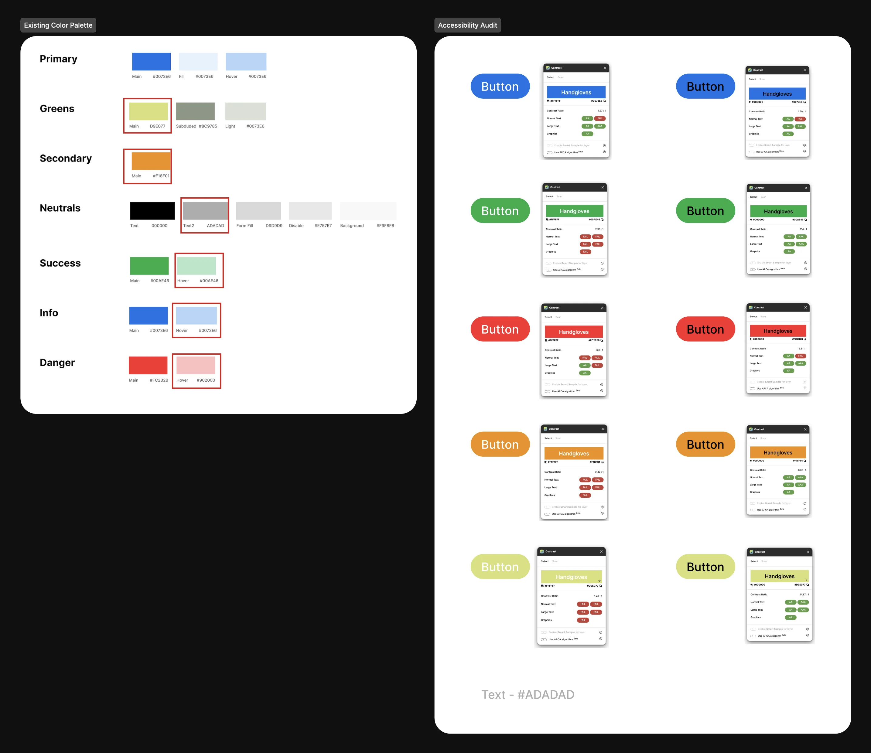
Accessibility mattered here because TRADEWORK's users are often working on job sites, in bright outdoor environments, and without much patience for software or new processes. I audited the existing color palette and pushed for a higher-contrast system that would hold up in real working conditions.
2 · UI, responsive and marketing
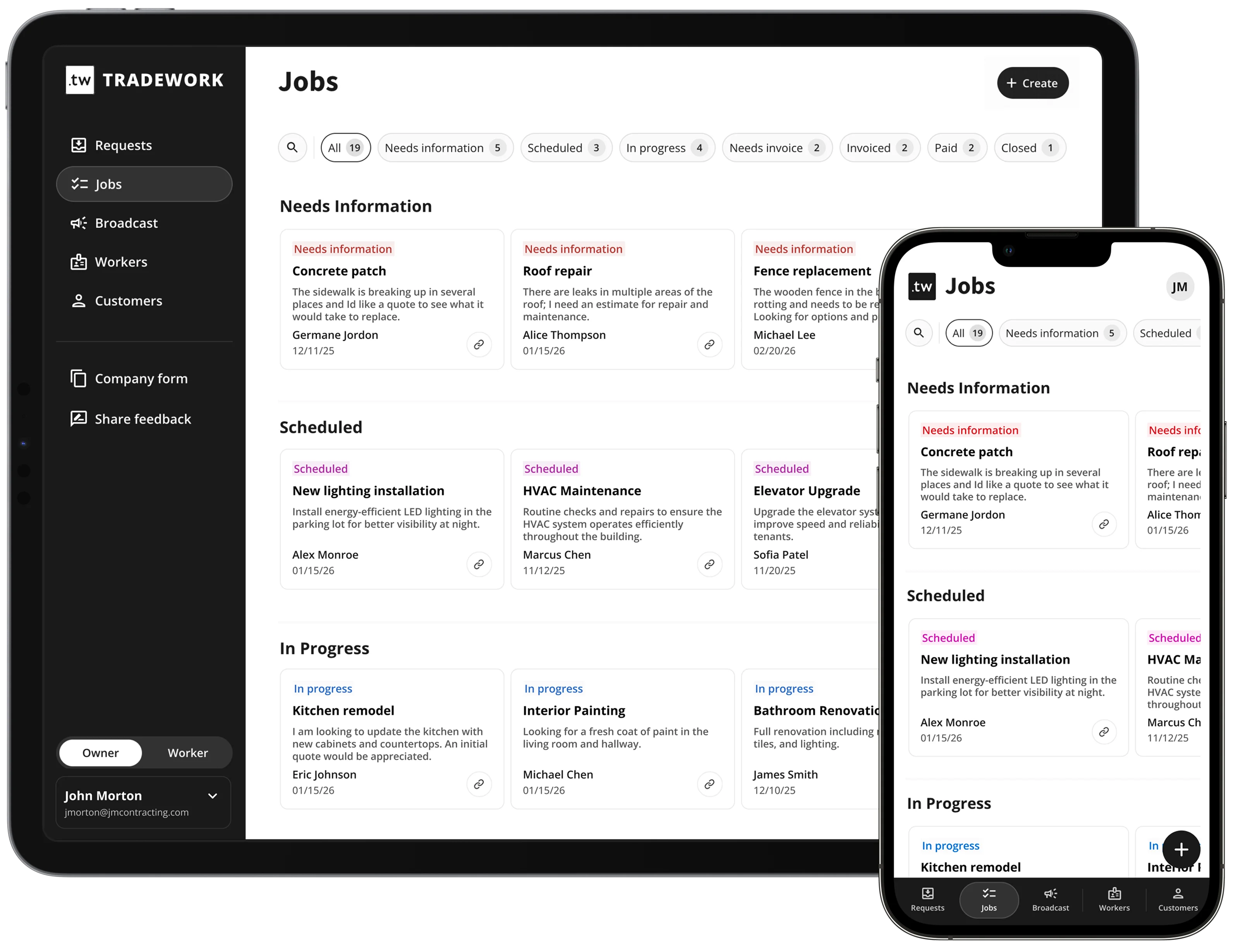
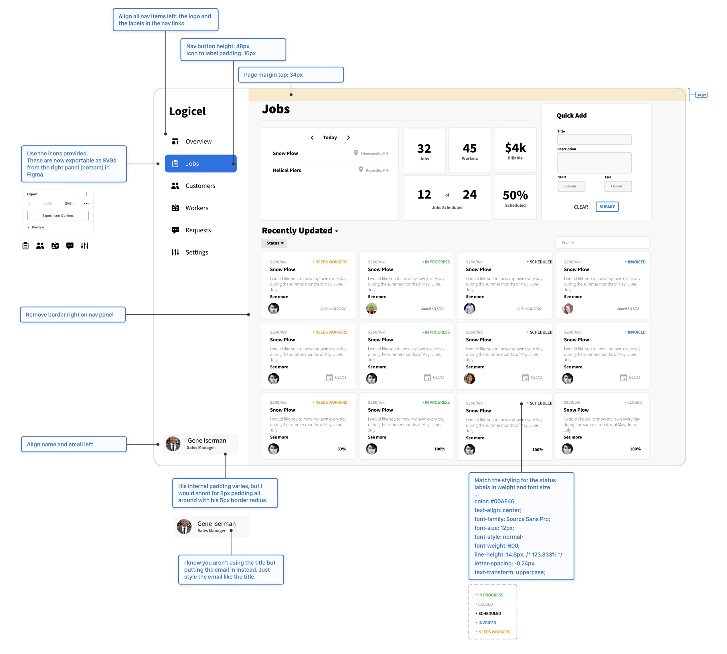
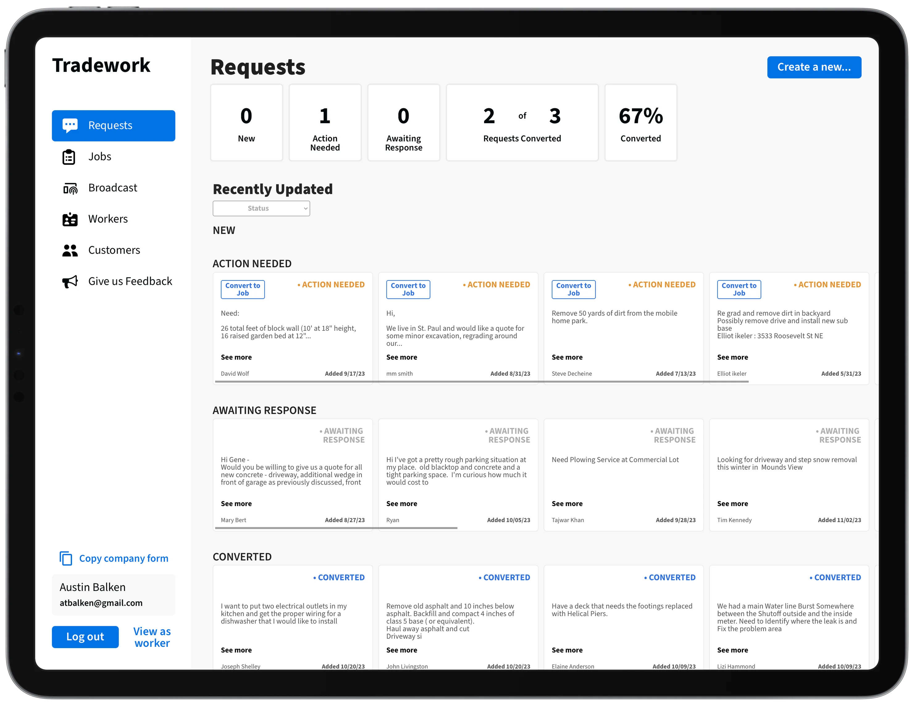
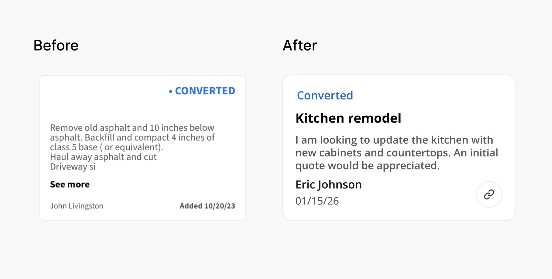
With the brand established, I began making UI updates to the existing product experience for quick, meaningful impact. This involved reviewing and replacing inconsistent styles with the foundations I had established, while improving the information architecture in key areas of the app such as job cards and site navigation.
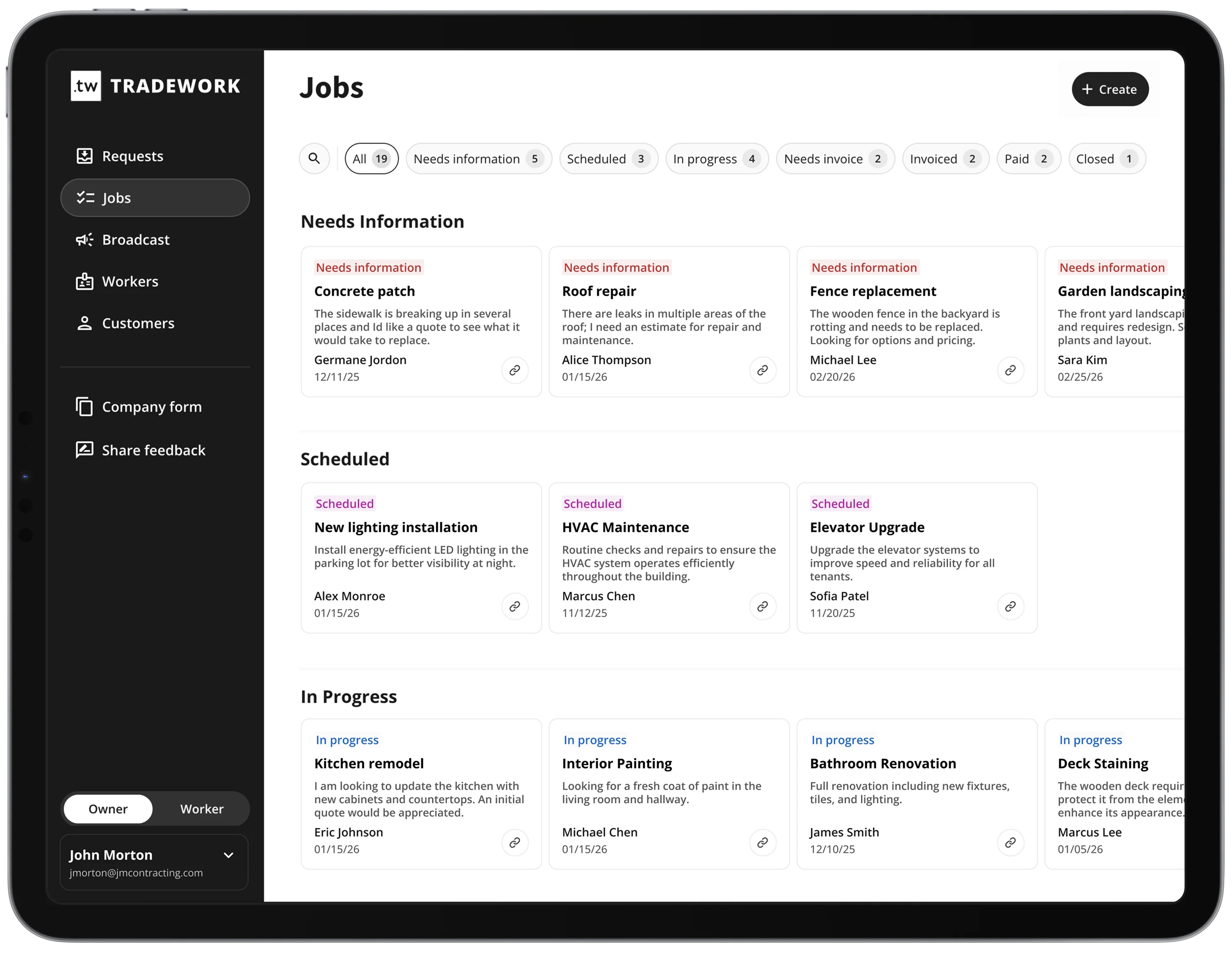
I also reworked the front-end UI to support a responsive mobile experience. This required rebuilding components and testing the experience across breakpoints to make sure it remained intuitive and functional in the field.
To market TRADEWORK effectively, I designed and shipped a new marketing site after several rounds of iteration with the team. We worked back and forth between my designs and their content until we aligned on the current direction.
The recurring question during the UI refinement process was which UX issues were worth fixing now versus which could wait. I made those calls based on visibility — what every user saw every day — and whether the inconsistency was creating real usability friction or just visual debt.
3 · UX enhancements
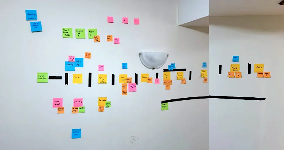
I facilitated workshops with the team to better understand and clarify the user's job flow and jobs to be done. That work informed the rework of the job cards and continues to shape CTA prominence and text hierarchy throughout the app.
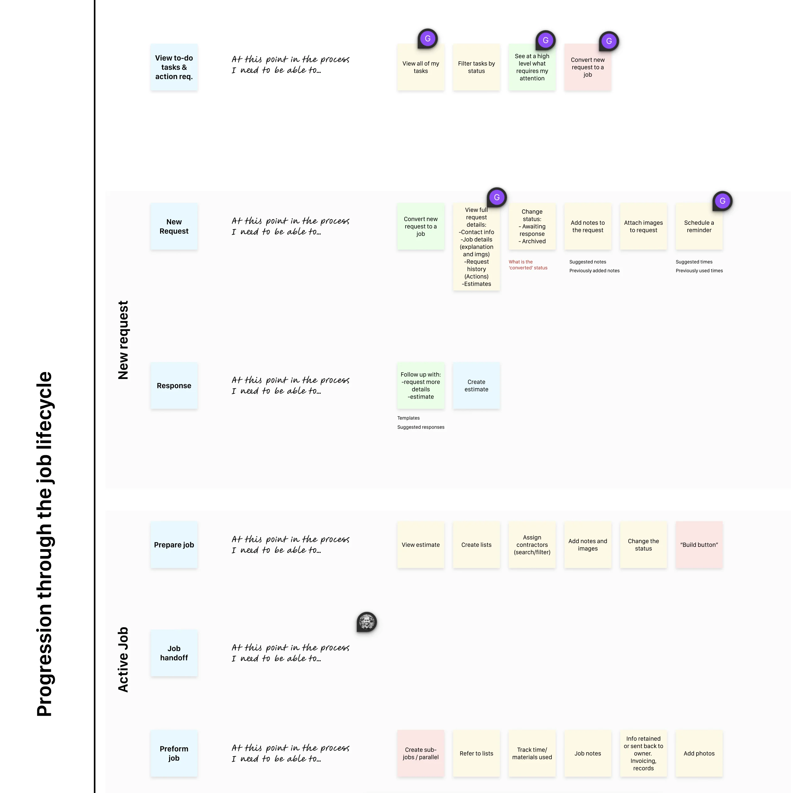
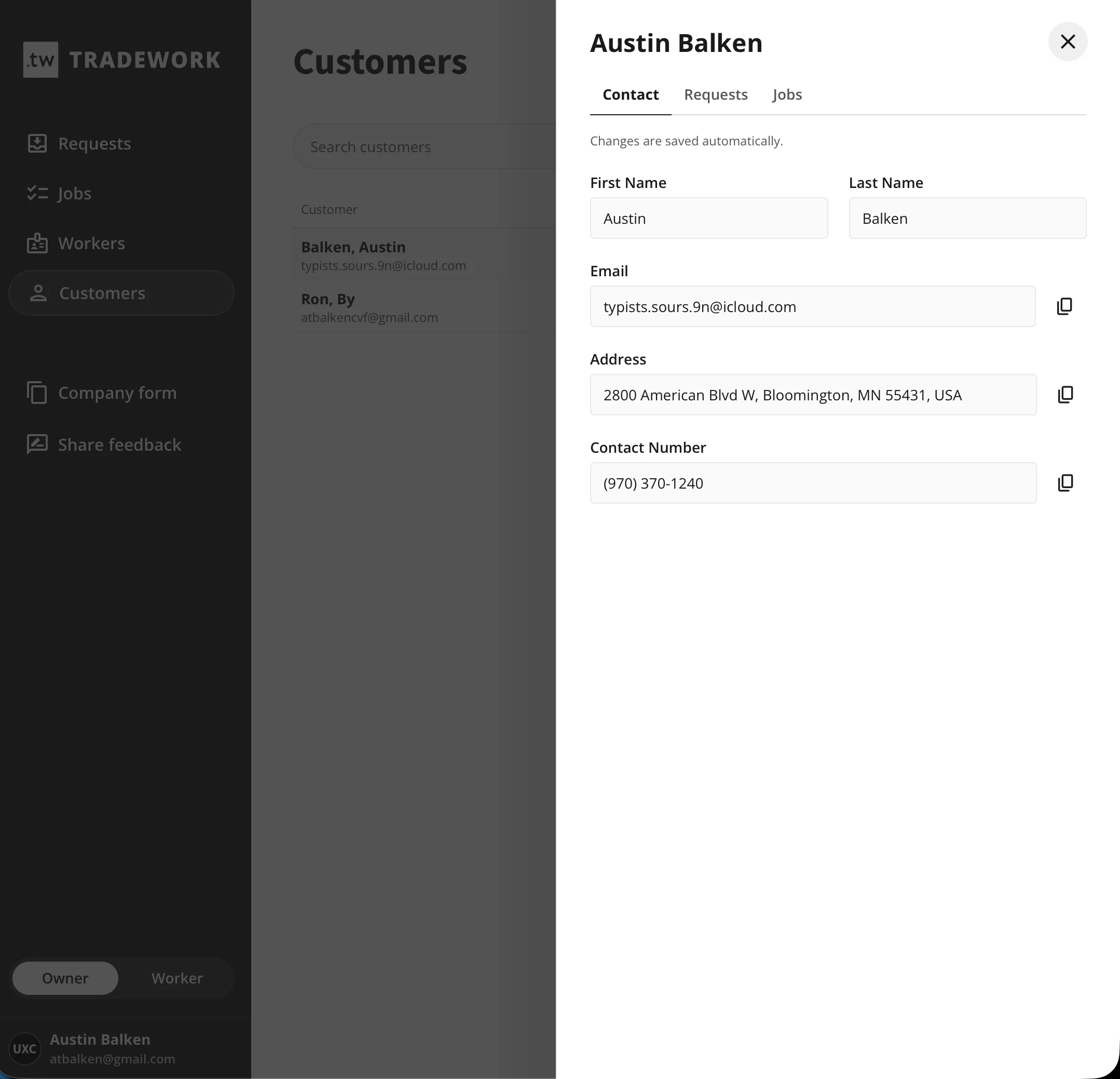
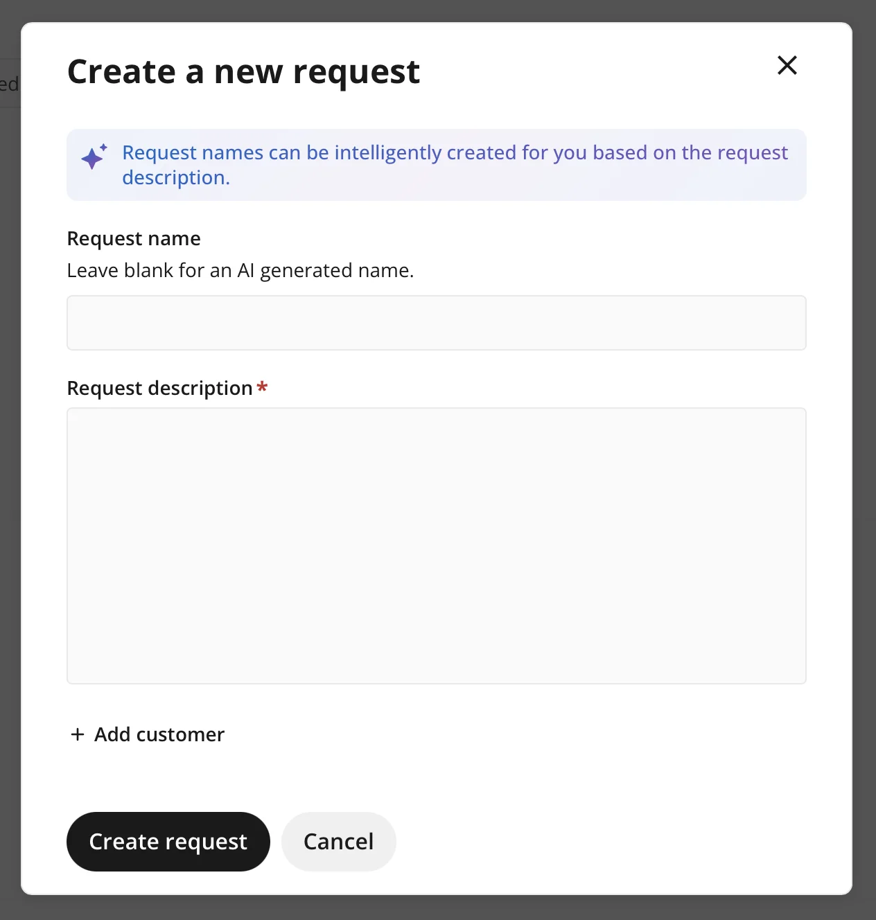
I suggested UX improvements for a more intuitive and less cluttered interface, such as using drawers with tabs instead of modals for information-dense flows, reworking cards for clearer hierarchy, and refining the customer request intake page.
4 · Features
The team is still making updates regularly and receiving valuable feedback from users. Before new work moves into development, we established a process for bringing design into the discussion earlier and producing design assets before development and release.
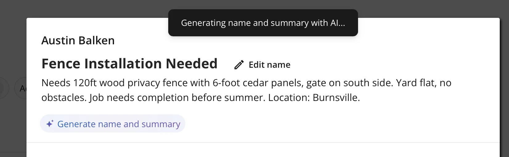
In addition to those process improvements, I've been able to suggest and implement meaningful feature improvements based on in-context usability studies and user interviews. One example was using AI to summarize a customer's request and auto-populate a job name and description. This gave every job card a clear title and concise, scannable context, which was a significant improvement for users who had been scanning request details on job cards to find the work they were looking for.
Outcomes
My work gave TRADEWORK a more cohesive foundation across brand, marketing, and product. Instead of each surface feeling like a separate effort, the product experience, marketing site, and customer-facing materials now feel connected by the same visual system and product direction.
That foundation has also helped the team move with more intention. Design is now brought into feature discussions earlier, giving the team clearer assets and decisions before development begins instead of relying on post-build QA to resolve product direction.
The product is now starting to bring in more paying customers and has seen increased adoption from users. As the team continues shipping updates, the design work is helping make the product easier to understand, easier to scan, and more credible for contractors evaluating whether TRADEWORK fits the way they work.
Reflection
TRADEWORK has been the clearest example of what it means to operate as the first designer inside a startup: owning direction across brand and product, deciding what to fix first, and creating just enough process for a small engineering team to move with more confidence.